How to choose a gemstone when you have an exact color in mind
Start with a few clear color references, then compare actual gemstones under consistent lighting. The goal is a shade you love in a material and design that suit your life, not a promise that a stone will match a screen image in every environment.
You can be very specific about the color.
Not just green. That green. The one that is a little blue but not too blue, soft but not washed out, and please not yellow, except now there is one picture with a warmer green that you also love and you don't quite know how to explain why.
That is a useful conversation. We can work with that.
My family has been in the jewelry business since 1979, with colored gemstones a particular part of our history. One of our tourmaline dealers is such a close family friend that he read me bedtime stories when I was six, at my insistence. I wrote more about that in how we source a colored gemstone.
Those relationships give us people to talk to. Your references give us a direction. Then we have to look at the stones that actually exist.
What kind of color reference should I send?
Send a small set of images and explain what you like about each one.
A ring photograph is helpful, but a color reference doesn't have to be jewelry. If a particular fabric, flower or other object captures the shade you mean, it can help start the discussion. It doesn't establish that a gemstone in precisely that color is available, but it gives us something more useful than a word that means different things to different people.
If possible, include a picture that is close but wrong. Tell me why. “Too gray” or “I don't like that yellow undertone” can narrow the brief quickly.
And tell me whether you love the color by itself or the whole combination. A pale stone in a warm metal setting might appeal to you for different reasons than the same-looking shade against white metal.
We don't have to solve all of that before you send the pictures. We just need somewhere to begin.
How do we describe the color more precisely?
Separate the basic color, how light or dark it is, and how strong or muted it appears.
You may hear those described as hue, tone and saturation. They help us move beyond a broad color word without requiring you to become a gemologist. GIA discusses these color attributes in its colored-gemstone value factors.
In practice, I want to know whether you mean a blue-leaning green or a yellow-leaning green, whether you want it pale or deep, and whether you like a softer impression or something more saturated.
You may not know the answer until you see a few examples. That's okay. Sometimes it is much easier to point at a stone and say “more like this” than to invent the perfect description in advance.
Can a gemstone match a photograph exactly?
A photograph can guide the search, but it cannot guarantee an exact match in every light or on every screen.
A gemstone interacts with light. The photograph also has a light source, a background, a camera and processing choices between the stone and what you see. GIA's gem photography guidance explains how lighting and background affect the result.
That doesn't make photos useless. It means we should use them thoughtfully.
I would want to compare candidates under similar conditions and see movement as well as still images. If one photograph is dramatically lit and another is taken in softer light, we need to be careful about treating the difference as a clean comparison between the stones.
You are choosing something to wear beyond the moment in which its listing picture was taken.
What views help when comparing candidates?
Comparable face-up views and videos help us discuss the color and appearance more clearly than unrelated close-ups alone.
I would want to know what the lighting is, see the stone from the angle you will usually look at it in a ring, and have a sense of what happens as it moves. Looking in daylight and ordinary indoor light can help you understand the appearance you are choosing.
This isn't a promise that a gemstone will look identical everywhere. It is a way to make the differences easier to understand before you commit.
When you send feedback, be specific about what changed for you. Was the color too dark in one view? Did you prefer a softer shade? Did the video make you love a stone you had overlooked in the still photograph?
That reaction helps us refine the search. It is more useful than trying to persuade yourself you like the first candidate because it technically fits the description.
Should we search by color or gemstone type?
If the color is your priority and you are open to different materials, we can explore more than one gemstone type. If a particular material is essential to you, that sets a different boundary.
I work with unusual colored gemstones as well as natural and lab-grown diamonds. We can discuss possibilities without pretending that different materials with similar colors are interchangeable.
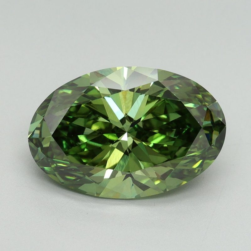
Our mint-green engagement ring guide explores one specific shade family. In my own sourcing experience, finding an amazing rich green in a lab-grown diamond is harder than simply finding something described as green, but we've done it. That experience is a reason to explore a brief, not a guarantee that the same shade and shape are always available.
Rich green and pale mint also aren't the same request. I want to see which one you mean.
What if the color I love comes in a more delicate stone?
We should balance the color with how you want to wear the ring, rather than choose the shade first and leave the practicalities until later.
An occasional ring and an everyday engagement ring have different jobs. A stone that asks for more care might make sense in a sometimes ring, provided you understand its vulnerabilities and the setting suits it.
Opal is an example I would approach cautiously for everyday engagement-ring wear. GIA describes its relatively low hardness, limited toughness and sensitivity to heat or sudden temperature changes. Its opal care guide explains why those considerations matter.
I wouldn't try to change your heart if it was truly set on a particular stone. I would want you to understand the tradeoffs, and we could talk about a different material, a different kind of piece or the care the original choice would require.
Finding a balance between lifestyle and color is a big part of how I like to work. The alternative shouldn't just be practical. It should still feel like something you love.
Does the setting belong in the color conversation?
Yes. Think about the stone in the ring you want to wear, not only loose against a neutral background.
The metal, the amount of visible metal and the proportions all contribute to the overall impression. If you love a reference with a substantial frame around the stone, a similar color in a very open setting might not give you the same feeling.
I want to separate those preferences so we know what we are looking for. Is it the gemstone's shade? Its shape? The contrast with the metal? Or the way those things come together?
With custom engagement ring design, we can work through that combination. The stone and setting do not have to be unrelated decisions made on different websites.
Personal meaning can be part of it too. Our marquise ring upgrade used four hidden stones to represent a family. Your color reference might also have a personal association, and I would like to hear it if you want to share it.
How flexible do I need to be?
You don't need to abandon the color you love, but it helps to rank your priorities.
If we are trying to match an exact shade, a particular shape, a narrow size range, a specific material and a fixed budget at the same time, the search has more constraints. Tell me which one you would consider changing and which one is the whole reason you started.
Maybe you would accept a smaller stone for that color. Maybe you are open to a different shape. Maybe none of the candidates feels right yet and you would rather keep looking, with a realistic conversation about the timeline.
I don't want “close enough” to quietly become the brief unless you have decided the whole combination makes you happy.
Send me a few references, the colors you definitely don't want, your budget range and whether the ring is for daily or occasional wear. We can turn that into a search with a clear direction.
And when you see the one that makes you stop scrolling, tell me. That is the moment I am looking for too.
Send your color references, budget range and whether this is an everyday or occasional ring. Email Chloe.